Correctly displaying website pages across multiple devices forms a critical part of modern web development. With many sites now seeing a roughly 50/50 split between desktop and mobile traffic, sites have to contend with a huge range of display resolutions, each of which changes the way people interact with the site.
Not supporting a device can quickly turn users away, and potentially lose valuable leads and conversions.
CSS breakpoints are often cited as a solution to this problem but remain widely misunderstood and underused. So what exactly are CSS breakpoints, how do they work, and what are the best practices for implementing them?
Read on to find out more about this pillar of Responsive Web Design. In this blog we’ll explore how implementing CSS breakpoints can improve your websites’ design and usability, and improve processes and efficiency for your team.
What are CSS breakpoints?
They may sound like ‘breaking points’, but breakpoints are actually a point of positive change for websites, rather than the point at which they collapse in on themselves.
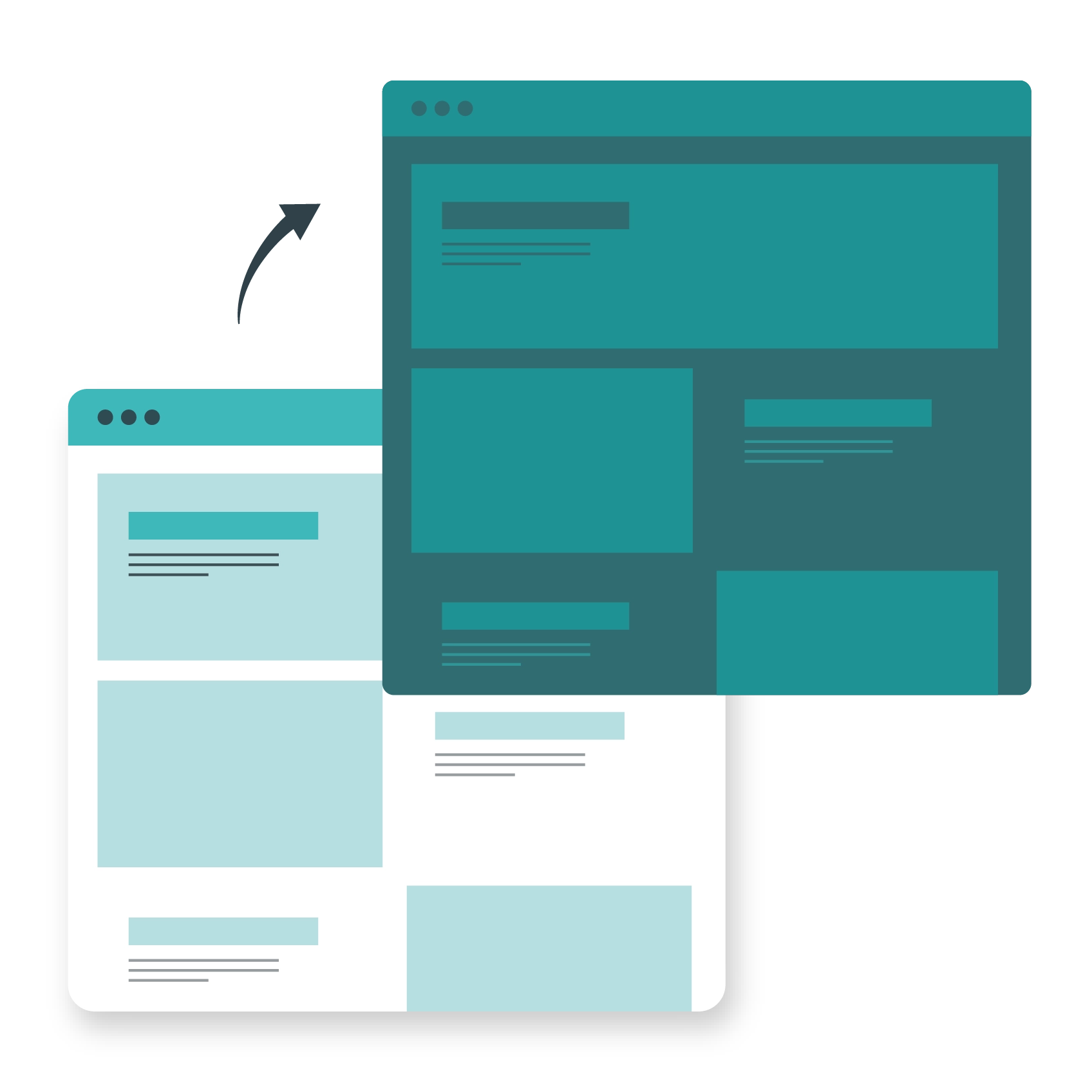
A breakpoint is a point at which the page dynamically adjusts to the size of the window it’s being viewed in, to provide the ideal user experience. This means automatically altering the page layout and formatting so that it fits naturally on that device, without needing to awkwardly scroll around.
CSS breakpoints achieve this through the application of CSS code. In CSS, breakpoints can be defined based on the specific device being used, or on the screen resolution of the device.
These breakpoints then dynamically adjust the page layout using the media query function in CSS3, changing elements such as column width, menu and button sizes, image sizes, slider functionalities, lightbox functionalities, video embeds, and more.
CSS breakpoints commonly follow a mobile-first approach due to the wide variety of screen resolutions and ratios on mobile devices and tablets.
Most sites will have at least three CSS breakpoints to accommodate the most common resolution on desktops, mobile phones, and tablets.
However, the growth of 4K screens, ‘ultrawide’ monitors, and devices like folding phones and flip phones mean it’s not uncommon to have six or more CSS breakpoints on a site.

One hosting platform for your agency.
Our platform was designed with your needs in mind, which means it’s easy to use, and time-saving too.Device-based vs content-based breakpoints.
Among sites that use CSS breakpoints, one of the common splits is whether to take a device-based approach or a content-based approach.
A device-based approach implements a separate breakpoint for each device used to browse the website, such as a Samsung Galaxy S21 or an iPhone 14. This allows you to tailor the dimensions and pixel ratio of the page precisely to that device, rearranging all of the content simultaneously.
The obvious drawback of this route is that you need to add a new block of code for every new device that goes to market. Even then, you’re likely to miss some devices unless you’re very attentive, such as the multitude of cheaper Android tablets from small manufacturers.
This risks providing a suboptimal experience for a small proportion of your audience, and creates more work for developers (though not everyone will consider that a bad thing).
A content-based approach focuses on delivering breakpoints for specific types of content (e.g. text) at a series of stepped resolutions, altering the layout whenever a new resolution is hit. You can see this in action when browsing a site with content-based breakpoints on a desktop computer by manually resizing the window.
This may be somewhat less precise, as content will be rearranged to the closest breakpoint resolution, rather than the exact resolution, but it ensures the widest possible compatibility and requires less frequent developer involvement.
A halfway point between these two strategies is to set breakpoints for groups of devices. Instead of setting dozens or hundreds of device-specific breakpoints, you can set a smaller number of breakpoints for groups of similar devices that fall within certain resolutions, using either a maximum or minimum pixel width.
These common dimensions can be found online or gleaned from previous usage data for the site.
How to use CSS breakpoints.
To create CSS breakpoints, you need to start with a media query. Here’s a basic example:

This query checks whether the device has a width of at least 300px. If it does, the font size of the text on the page changes to 12px. Let’s break this down in a bit more detail below.
A media query such as the one above consists of three distinct elements:
- Media type – what kind of media the code applies to
- Media rules – the rule/s that the device must meet for the CSS code to be applied
- CSS rules – the formatting changes that occur when any and all rules are met
Media types.
Media rules can be applied to four types of media. These are:
- all – all types
- print – printers
- screen – screens
- speech – screen readers
These types are inserted immediately after “@media” (e.g. @media screen). If no type is included (as in the example above), the query defaults to “all”.
Media rules.
Media rules allow you to target different states of a device as triggers for CSS rules. The most common example is the width and height of the ‘viewport’, i.e. the visible area of the web page.
This is used to distinguish from a device’s resolution, as the page is often smaller than the resolution of the device (such as when it is resized on a computer screen).
The following features can be used to target page dimensions:
- width
- height
- min-width
- max-width
- min-height
- max-height
The width and height features target specific widths and heights, which tend not to be very useful when trying to cater to many differently sized viewports.
The min-width and -height feature specifies the minimum value a viewport needs to reach, while the max-width and -height feature specifies the maximum value. Both can be used together or interchangeably to specify the desired dimensions for the rule.
Other commonly used media rule features include:
- orientation – detects whether the device is in ‘landscape’ or ‘portrait’ orientation to determine how content should be displayed. Ideal for phones and tablets.
- hover – detects whether a pointing device such as a mouse is being used. Ideal to enable hover functionalities such as rollovers or other interactive features.
- dynamic-range – checks the dynamic range capabilities of the display. Useful for displaying high dynamic range (HDR) content. Note, however, that a device supporting HDR does not mean that HDR is always enabled.
CSS styles.
This is where you’ll include the CSS styles you want to apply to specific classes when the above rules are triggered. Common examples include:
- font-size
- column-width
- margin
- padding
- border
The CSS rules you apply to content will obviously depend on the site and your level of design nous. You may want the font size for menus to change so that the full text is always displayed, even as the menu buttons get smaller.
You might want to change the font size or reduce the padding on text as column widths decrease to enable more text to fit into a smaller space. The beauty of CSS is that it affords you all of these opportunities – and media queries let you provide them for any and all devices.
Alternatives to CSS breakpoints.
While CSS breakpoints are extremely useful, they aren’t the only way to dynamically adjust webpage content. CSS flexbox and CSS grid are both layouts models specifically designed for responsive, flexible web pages.
A grid layout, for instance, can be used to fit as many grid elements as possible into the available space – adjusting the amount of content visible by looking at the component width, rather than the viewport width.
CSS breakpoints can also be augmented using the extension language Sass. Sass runs on top of CSS, adding useful features such as variables and nested rules, while still remaining fully compatible with CSS.
For example, the addition of variables means you only have to define the same change to multiple elements once, dramatically reducing repetition in your code.
The use of partials can also make your CSS more modular, which is ideal for websites following a responsive, mobile-first design philosophy.
A powerful tool for developers and agency owners.
Using CSS breakpoints is ultimately an incredibly powerful design tool and one that most developers and agency owners should consider.
While they’re not the only route to designing a responsive website, they’re one of the most intuitive and lightweight methods of ensuring a consistent browsing experience across all devices – helping to retain an ever-growing army of mobile visitors.
This will become increasingly important over time for agency owners or anyone offering web design services, as consumer behaviour changes and the minimum requirements for a functioning site expand.
By embedding the effective use of CSS breakpoints into your design processes, you can ensure that all of your clients’ websites display fluently across a wide variety of devices and resolutions, giving visitors and customers a slick and enjoyable user experience.
For more expert tips and advice from our knowledgeable team of web-hosting geeks, check out our blog, or explore our resource hub.

